Catch
Product Strategy, UI/UX Refresh
A redesign of Catch’s core app experience, including a refreshed home screen, automated onboarding, and support for the platform’s first paid features

Go Back

Go Back
Catch
Product Strategy, UI/UX Refresh
A redesign of Catch’s core app experience, including a refreshed home screen, automated onboarding, and support for the platform’s first paid features
Go Back
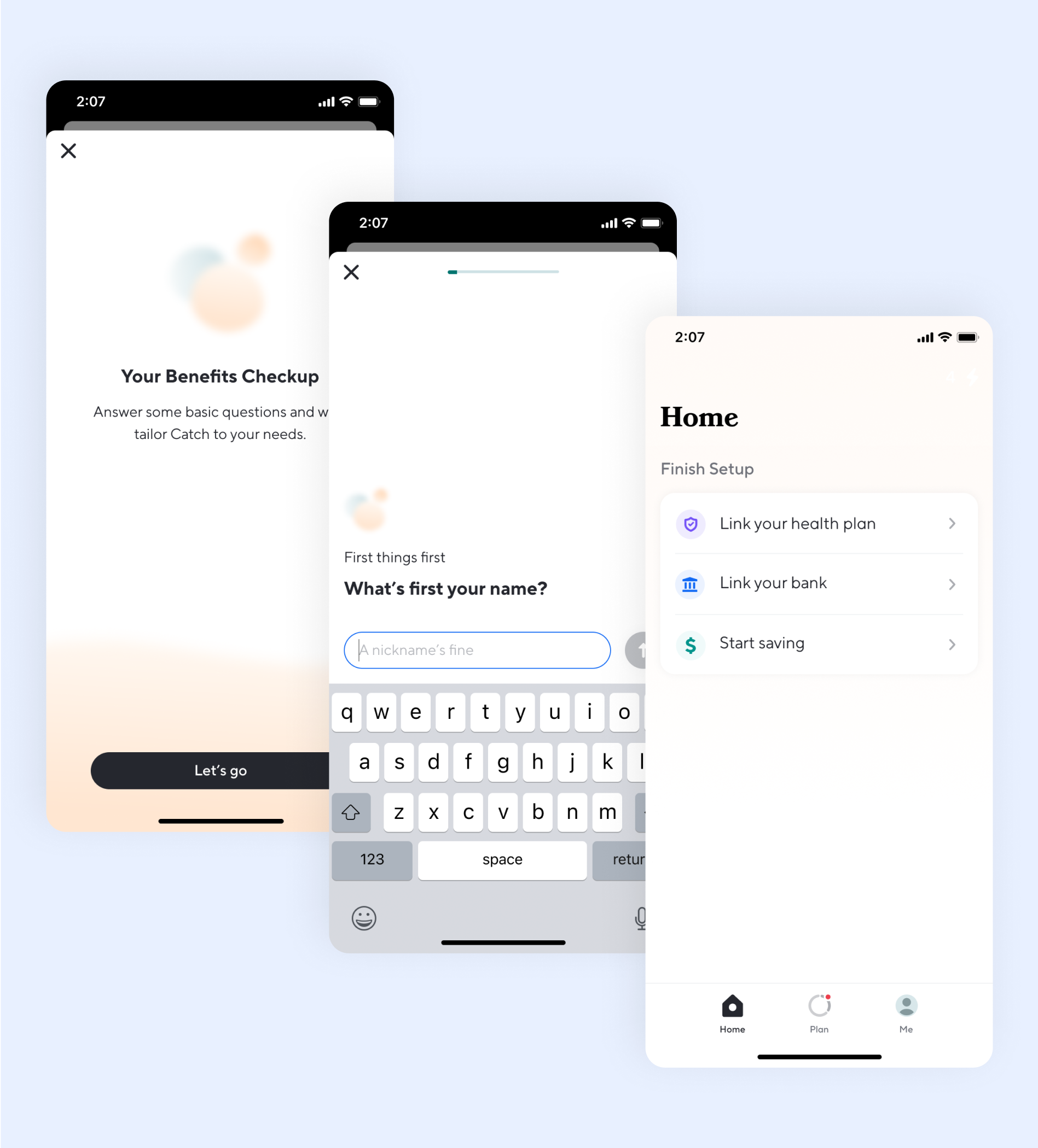
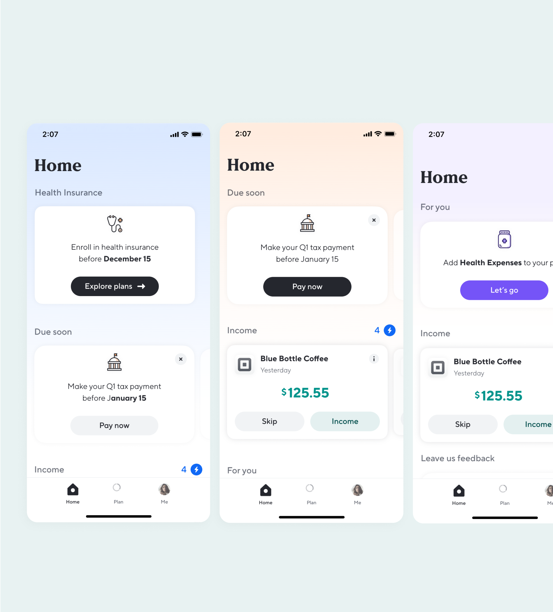
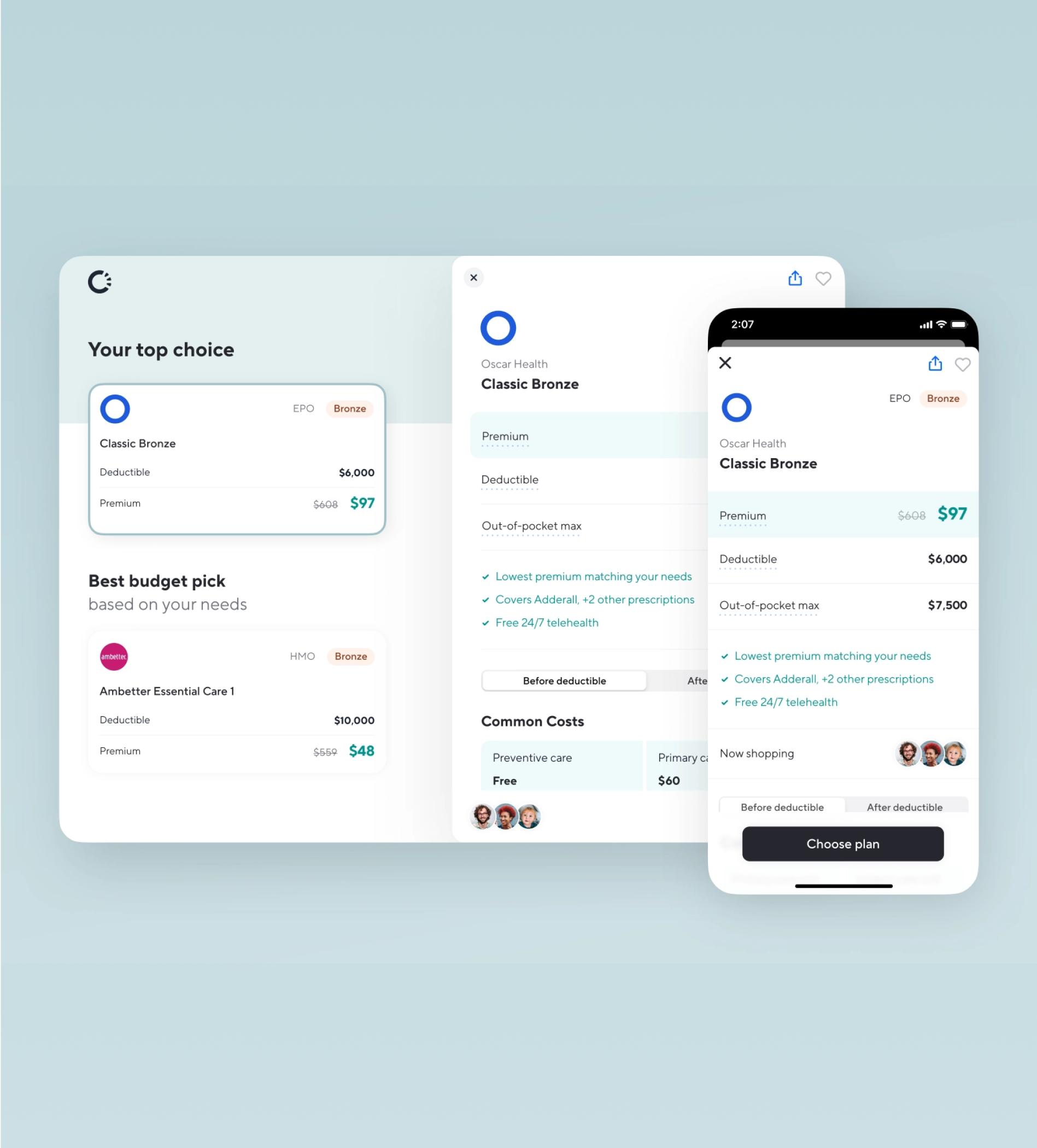
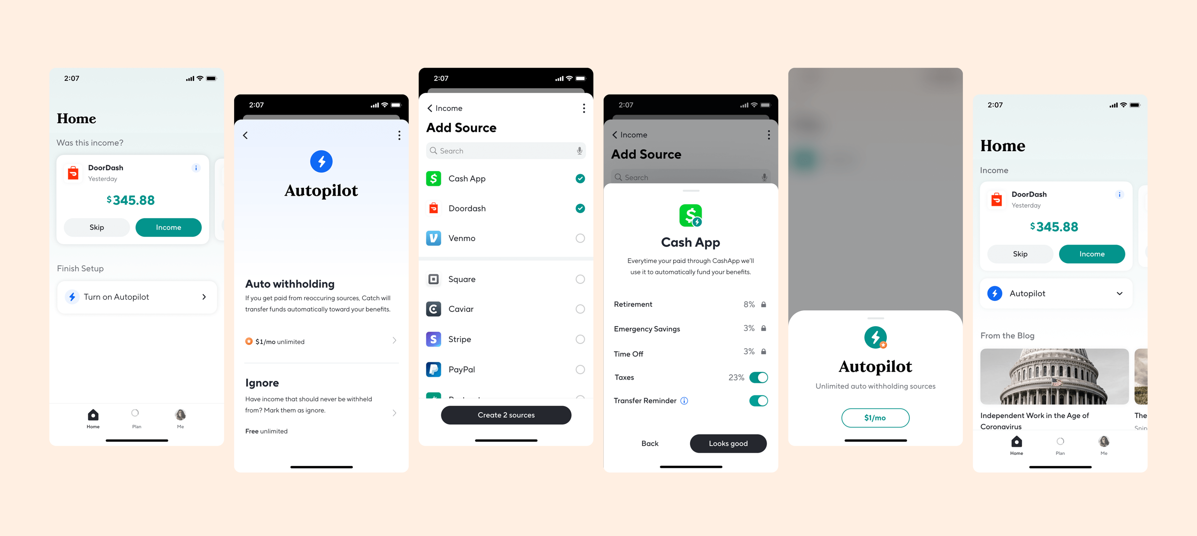
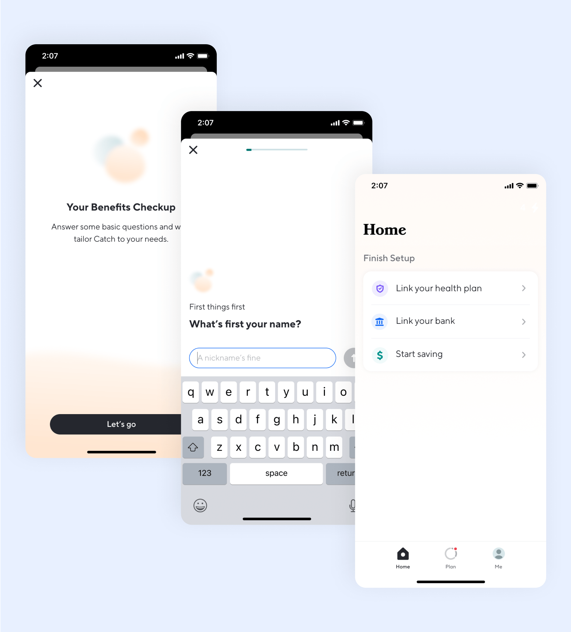
Overview
As Catch evolved from a free tax and benefits product into one offering premium features, the app needed a UX and UI overhaul to support new logic, paid flows, and a smoother first-time experience. The goal: help users understand the product’s value faster, and simplify how they take action—especially around automation, rule-building, and account management.
Team
Kate Mook | Product Design
Zack Labaddie | Design Manager
Andrew Ambrosino | Founder, Head of Product
Kristen Anderson | CEO